In this report we will give a brief overview on the current status of the PV technology and discuss its prospects.
In Fig.1 the global production of PV modules in recent years is shown. The vertical axis represents the annual production expressed in the total produced power capacity in MWp. The letter p denotes peak power, this means the maximum power a PV module can deliver if it is illuminated with the standardised AM1.5 solar spectrum. On the horizontal axis the time is shown. We see that the solar cell production is increasing more than 40% every year, which is exponential growth.
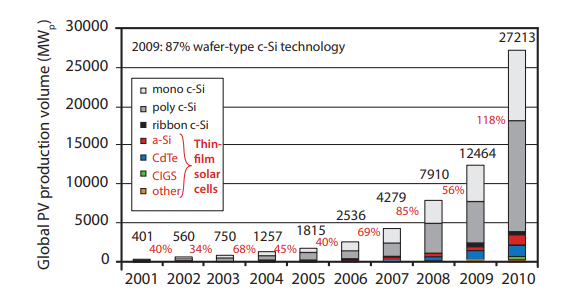
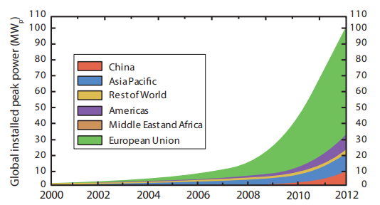
Figure.2 shows the worldwide cumulative installed PV power, which is exponentially increasing in time as well. By far the largest share is installed in Europe. It is followed by the Asia Pacific Region, where most of the PV power is installed in Japan. For China we observe a very strong increase in installed PV power since 2010. By the end of 2012 the 100 GWp threshold was passed for the first time. By the end of 2013, already almost 140 GWp was installed around the globe. Of all the installed PV power at the end of 2013, almost one third was installed in 2013 alone!
In Fig.3 the installed PV power in several countries at the end of 2012 is shown. About 31% of the total PV capacity is installed in Germany. This is a result of the German government’s progressive feed-in-tariff policy that was introduced in 2000 .1 Considering that Germany lies within an area with a relatively low radiation level that is comparable to that of Alaska, the large contribution of solar electricity to Germany’s electricity production indicates the promising potential of solar energy for the sunnier parts of the world.
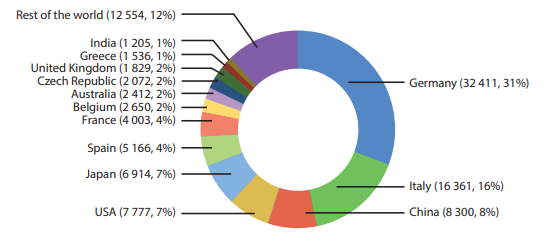
A very strong increase also is observed in Italy, which accounts for 16% of the world wide PV capacity. China with a contribution of 8% is the fastest growing market at the moment, in 2010, China only contributed with 2% to the global PV capacity. Within the top six, we also find the United States, Japan and Spain. Their PV capacity contributes between 4% (Spain) and 7% (U.S.A.). Also Japan shows a strong growth in PV installations.
After the Fukushima Daiichi nuclear disaster on 11 March 2011 the Japanese government introduced some progressive feed-in tariffs to promote and accelerate the introduction of renewable energy conversion technologies.
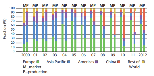
It is interesting to see that PV technology is not only a European affair. The local demand and supply has been changing rapidly in the last 13 years, which is illustrated in Fig.4. This figure illustrates the evolution of the world-wide supply and demand of PV modules in the various regions around the world. We see that in 2000 the biggest market was Japan with a total share of 40%. In 2000, Germany introduced the Erneuerbare Energie Gesetz (Renewable Energy act) which induced a strong growth of the German and hence the European PV market. By 2008, Europe had a market share of more than 80%. Back then, PV was mainly a European industry. Starting from 2009, the domestic PV markets in China, the Americas (mainly U.S.) and Asia Pacific (mainly Japan) are increasing very rapidly and catching up quickly with Europe.
Figure.4 also shows the supply side. Up to 2005 we see that the Asia Pacific and the Europe production shares were slowly increasing, as their growth was faster than that of the other regions. Since then the picture changed drastically! Since then the Chinese production share was increasing very strongly. This can be explained by the fact that the Chinese government made huge investments in order to scale up PV module manufacturing in China. In 2012, around 60% of all PV modules were produced in China.
In 2000, the PV markets was an essentially local, meaning the European companies produced for the European market etc. The local demands and supplies in Asia, the Americas and Europe were in balance. In the last years, the market has become a global market. As a result, in 2012 no local balance between supply and demand existed anymore. While the majority of the demand is in Europe, the majority of the production is in China.
The demand also is strongly stimulated by the decreasing cost price of PV technology. Figure.5 shows the learning curve of PV technology. The learning curve shows in a graphical way, how the cost price develops with increasing experience, where the experience is expressed by the cumulatively installed PV capacity. With more PV produced — and hence also with time — the PV industry gets more experienced. On the one hand, the industry learns to increase the energy conversion efficiency without increasing the cost via better and better understanding the production process and hence increasing the production yield. On the other hand, industry also learns to produce more efficiently, which means that the man power required per production unit can be reduced. Also, the materials and energy required for producing the PV modules becomes less and less per production unit. In addition, also up-scaling reduces the cost. Learning curves usually show an exponentially decreasing cost price, until the technology or product is fully developed.
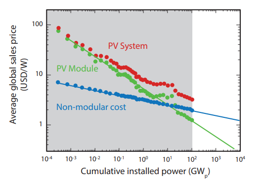
In Fig.5, the averaged global sales prices of a PV module versus the cumulative installed power up to 20 GW is shown. Note, that the points up to 20 GW (up to 2009) in the grey area are real data points, while the points in white area are extrapolation of the general trend. It is important to note that the sales prices, except for some fluctuations, follow a largely exponential decay. Currently, the average retail price of PV modules is below 1 US Dollar per Watt-peak. However, cost price of a PV system is not only determined by the module. The red dots show the decrease in the cost price of complete PV systems. While in the early days of the PV technology, the system price was dominated by the module price, currently, the cost of the non-modular components of PV systems are getting more and more dominant. With non-modular components, we refer to components such as the the racking, wiring, inverter, batteries for stand-alone systems, and also the maintenance costs. The difference between the red and green line corresponds to the non-modular costs, which is dropping much slower than that of the PV modules.
As a consequence, PV technologies with higher energy conversion efficiencies have an advantage, as with higher efficiency less area is required to install the same PV power. As the area is directly linked to the nonmodular costs, technologies with higher efficiencies require less modular costs which has an positive effect on the cost price of the complete PV system. Consequently, the c-Si PV technology, with module efficiencies ranging from 14% up to 20% has an advantage with respect to thin-film technologies, that have lower efficiencies.
Howe do these numbers compare to solar electricity? This question is answered in Fig.6 (a), where the installed capacity (in GW) of several electricity generation technologies is shown on a logarithmic scale. The figure only considers electricity generation technologies that are not dependent on fossil fuels. We see that the installed nuclear power capacity is hardly growing anymore, while the installed hydropower is still slightly growing in time. Wind is growing at a much faster rate of 20% per year. Solar has by far the largest growth rate with an annual increase of installed capacity exceeding 40% since 2008.
However, it is not fair to compare the installed power between technologies like this, because the numbers shown in the graph represent the maximum (peak) power the different technologies can generate instead of the average power they have delivered in reality. The relationship between the totally installed power and the power generated on average is called the capacity factor CF. Of the technologies shown in Fig.6 (a) nuclear has by far the highest capacity factor with CF(nuclear) = 90% followed by hydropower with CF(hydro) = 40%. For wind electricity we assume CF(wind) = 30% and for solar electricity CF(solar) = 15%. The low capacity factor for PV systems can be explained by the fact that for most geographical locations, almost half of the solar day is devoid of solar radiation at night time.
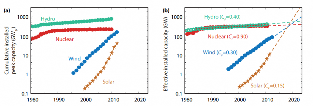
Figure.6 (b) shows the effective installed power corrected with the capacity factors. Currently solar energy generates about an order of magnitude less electricity than wind energy and more than two orders of magnitude less than hydro and nuclear electricity. Seen the development in recent years we however can claim that the trend in the growth of solar energy will continue the coming years. If we therefore extrapolate the trends of the last decade until 2020 we see that the installed power of solar energy will exceed nuclear, wind and hydropower by then. It is just a matter of time until solar electricity will be the most important electricity generation technology that is not based on combustion of fossil fuels.
Of course, we have to justify why solar electricity can grow much faster than the other technologies shown in Fig.6. First, solar radiation is available everywhere on Earth and it is available in great abundance. The amount of solar energy incident on Earth is about 10,000 time larger than the total energy consumption of mankind. As hydroelectricity is powered by water that is evaporated by the sun and falls on the ground as rain, it is a secondary form of solar energy. Also wind arises from temperature and pressure differences of the atmosphere and hence also is a secondary form of solar energy. As a consequence, solar energy is by far the largest available form of renewable energy.
Secondly, hydro- and nuclear electricity are centralised electricity generation technologies. For hydro power plants, big dams are needed. Also nuclear power plants have large power rates at about 1 GW. Building new hydro and nuclear power plants requires large public or private investments. While solar electricity can be generated in large PV parks or solar thermal power as well, it has an unique advantage: PV systems can be installed decentralised on every roof. Electricity consumers can generate a least a part of their required electricity in their own homes, which makes them partially independent of the electricity market. In addition, the cost price of PV systems has dropped below grid parity in large parts of the world. This means, that averaged during the lifetime of the PV system PV generated electricity is cheaper than electricity from the grid.
We believe that the installation of decentralised PV systems will be the big force behind the solar revolution in the coming years. It will change the energy landscape much faster than most people think, which is justified in Fig.6 (b). As more and more people become aware of these facts, it is more likely that the growth will be further enhanced than it will be slowed down.